From desktop legacy to mobile first: Redesigning MDLinx for the Modern Clinician
UX Research • Design strategy • UI/UX • Front-end development

Redesigning and rebranding medical news platform to be mobile-first increasing daily engagement and return visits by simplifying navigation, introducing interactive learning tools, and delivering responsive layouts empowering busy clinicians to learn faster, stay informed, and connect seamlessly across devices.
Tools
Adobe Illustrator, Photoshop, Sketch, Balsamiq, Framer
My Role
Product Designer & Web Developer
Duration
9 months, Discovery - Launch
Problem statement.
MDLinx, a trusted resource for medical news and clinical updates, was designed primarily for desktop. However, traffic analytics revealed that the majority of users, busy physicians and healthcare professionals, were accessing the site via mobile devices, where the experience was clunky, slow, and hard to navigate.
The challenge.
The challenge was to transform MDLinx into a mobile-first experience that met the pace and demands of modern clinicians: delivering fast, scannable, and accessible medical information without sacrificing depth, accuracy, or brand trust.
Discover
Leveraging M3 USA's research capabilities
M3 USA, the owner of MDLinx, boasts a comprehensive medical research arm M3 Global Research. We leveraged their full-service interview lab, providing both qualitative and quantitative research solutions. This enabled us to conduct in-depth user interviews and usability testing, ensuring that our design decisions were grounded in real-world clinician experiences.
Qualitative insights
Through structured interviews and contextual inquiries we engaged with physicians, nurse practitioners, and medical students. These sessions revealed critical pain points.
-
Dr. Alicia Chen, Cardiologist
“Between patient rounds, I only have a few minutes to catch up on anything. It takes too long, a lot of scrolling. I get through one article maybe.”

-
Marcus Hill, NP
“Pop-ups and ads constantly interrupt me when I’m trying to skim an article. I need the information fast, without distractions”

-
Medical Student Priya Desai
“I love the content, but the site isn’t easy to navigate on my phone. Sometimes I can’t even find what I was reading yesterday without a lot of searching.”

Define
An experience outpaced by Its own content
Years of heavy investment in medical content left the MDLinx interface struggling to keep up. While the articles remained valuable, the experience lagged behind user expectations, especially on mobile.
Outdated visual design
A cluttered, desktop-era layout failed to reflect MDLinx’s leadership in clinical knowledge.
Content overload
Dense article lists and competing promotions overwhelmed users, diluting engagement.
Overbuilt navigation
A maze of menus and subcategories buried high-value content, making discovery confusing.
Poor responsiveness
Pages broke or required pinch-and-zoom on phones, creating friction for on-the-go clinicians.
Defining design principles for a mobile-first MDLinx
To guide every feature and screen, I distilled insights into concise design principles. These principles ensured the experience remained fast, habit-forming, and cross-device friendly, while keeping clinicians in control of their learning.
Scannability & Speed – Bite-sized content and swipeable series previews for thumb-friendly interactions that are quick to scan and fast to load.
Engagement on the Move – Micro-moments built for commutes, breaks, waiting rooms—into effortless learning opportunities.
Personalized Navigation – Save-for-later functionality empowering users to curate their own learning journey, even when distracted or pressed for time.
Beyond personas—Designing for behavior, not demographics
Instead of static personas, we developed behavioral archetypes to capture patterns of use that transcend age, title, or specialty. This approach let the team focus on motivations and context, how people interact with MDLinx across a busy clinical day, rather than superficial details like gender or location. Archetypes gave us sharper design targets and clearer opportunities to grow engagement across channels.
The Time-Pressed Clinician
Mid-career physicians like Dr. George Williams need fast, credible updates they can absorb between patients. They value brevity, reliability, and seamless mobile access over visual polish.
“If it isn’t quick and credible, I don’t have time for it.”
The Multitasking Practitioner
Nurse practitioners and physician assistants toggle between direct patient care and administrative tasks. They crave frictionless navigation and content that can be paused, saved, and resumed throughout the day.
“I need it to pick up where I left off.”
The Hungry Learner
Residents and medical students, like Priya Desai, are voracious consumers of clinical knowledge. They want structured learning paths, easy search, and habit-forming features like trivia to build daily engagement.
“Give me tools that make daily learning a habit.”
Mapping opportunities to grow engagement—A day in the life
To uncover opportunities for engagement by channel we knew the answer was centering the user, the human. So we mapped a day-in-the-life journey of a mid career clinician using MDLinx.
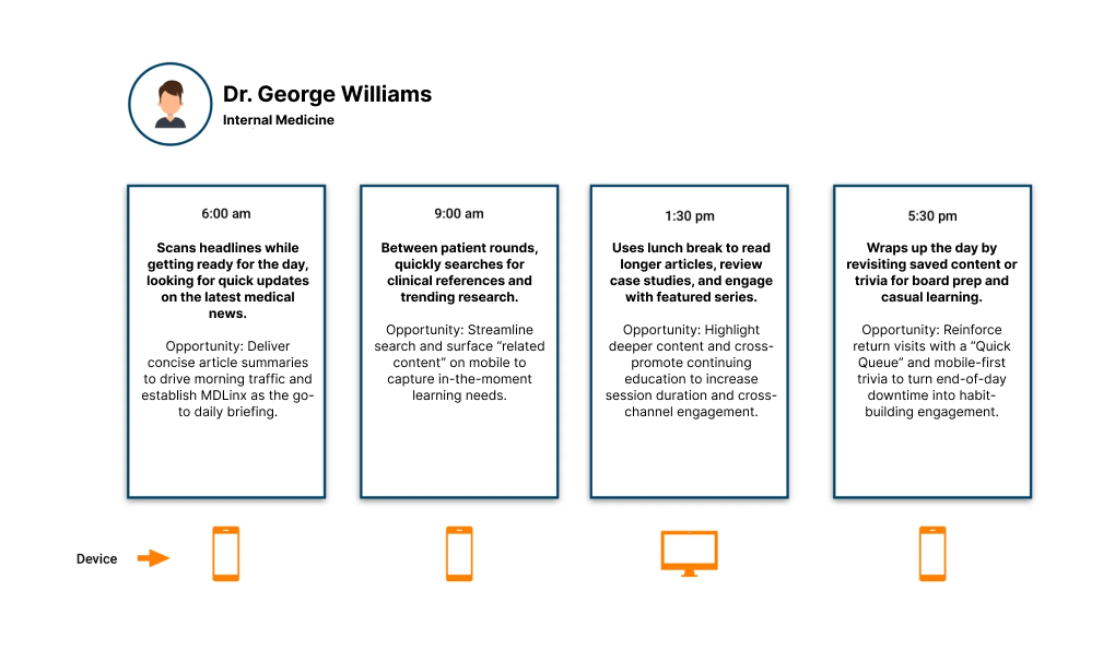
Turning insight into a roadmap
I led a workshop with product, engineering, and editorial stakeholders to translate user pain points into prioritized requirements. We aligned on tackling navigation simplification, responsiveness, and digestible content formats as the first milestones. The archetypes gave the team a shared language to cross functional teams on an actionable plan forward.
“Truly understanding the customer was the key to turning raw data into a clear path forward”
Design & Develop
New look, new features built for learning on the go
We reimagined MDLinx’s interactive content to turn quick breaks into meaningful learning moments all designed mobile-first while preserving a rich desktop experience. Paired with a refreshed brand giving the site a look and feel that matched it’s credibility and clinical authority.
Digital Rounds
Interactive case studies accessible from the home page where clinicians solve real scenarios alongside experienced mentors. Users view the correct answer and join a follow-up discussion, creating a chat-like vibe.
Why it works: Encourages quick clinical problem-solving and peer interaction, driving repeat visits and deeper engagement.
Daily Trivia
The classic Smartest Doc quiz distilled into a single-tap card for instant participation and streak tracking.
Why it works: Short, habit-forming quizzes fit naturally into a clinician’s busy schedule, boosting daily engagement.
Featured Series Snapshot
Curated multi-part articles presented as collapsible covers on mobile for thumb-friendly browsing, with a more expansive, magazine-style layout on desktop.
Why it works: Mobile users get a quick, scannable entry point, while desktop readers can explore richer visuals and deeper summaries, keeping both audiences engaged.
Up-Next Navigation
Sticky “next article” cards on mobile keep readers moving, while desktop offers an expanded panel of recommended content.
Why it works: Seamless, context-aware navigation reduces drop-offs and increases total session time across devices.
Outcome—Measuring success
The mobile-first redesign and brand refresh transformed MDLinx into a modern, habit-forming platform for clinicians on the go. By simplifying navigation, optimizing for small screens, and introducing interactive learning features, we delivered a faster, more engaging experience that strengthened both user loyalty and market credibility.
+ 35% mobile session length
20% decrease in bounce rates
+15% monthly page views
+ 27% return visits
Reflection—The takeaways
Leading the MDLinx redesign pushed me to grow as a designer, developer and a strategist. Balancing the needs of busy clinicians with the business goals of M3 required me to champion human-centered research while navigating brand, content, and technical constraints. Guiding a mobile-first transformation without alienating a loyal desktop audience sharpened my ability to connect data, design, and stakeholder alignment into a single, compelling vision.